
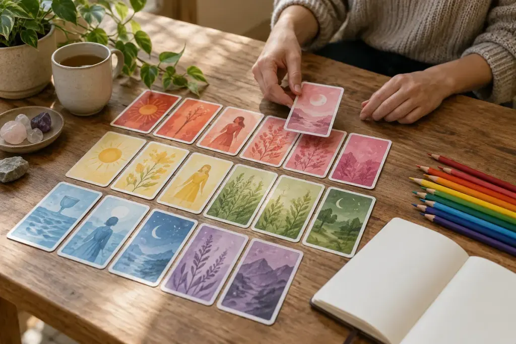
Shuffle a deck and the pictures arrive as individual cards. Spread a few cards by colour and a different set of relationships appears: the same red returns in a cloak, a roof and a small flower. A colour index gives you a way to notice those choices without pretending they form a universal code.
Start with one deck and one colour
Choose a deck you own and a colour that appears often. Find five cards containing it. Record where the colour sits, how much space it occupies and what surrounds it. “Small red object against a pale background” is an observation. “Red always predicts conflict” is an unsupported rule.
Keep the deck title and edition in your notes. A recoloured edition or another artist’s interpretation may alter the comparison. If you use photographs for your private reference, avoid assuming that ownership of a deck permits reproducing its artwork publicly.
Ask what the colour is doing here
On one card, the colour may attract attention to a hand. On another, it may connect a figure with the landscape. Describe the relationship before consulting the guidebook. Then note whether the guidebook discusses the colour at all. An absent explanation is not permission to invent an authorial intention.
For creative reflection, turn an observation into a question: “What small detail is taking more of my attention than the rest of the scene?” Keep the response about your own thoughts or a fictional character. Do not use the exercise to diagnose someone, predict events or replace practical advice.
After several sessions, revisit the first page. You may find that your early colour labels were too broad: scarlet, muted rust and pale pink can feel quite different within a composition. Add nuance instead of forcing each card to obey the original category.
The finished index is a record of looking. Its value lies in noticing more, not in making every card deliver the same answer whenever a familiar colour appears.