
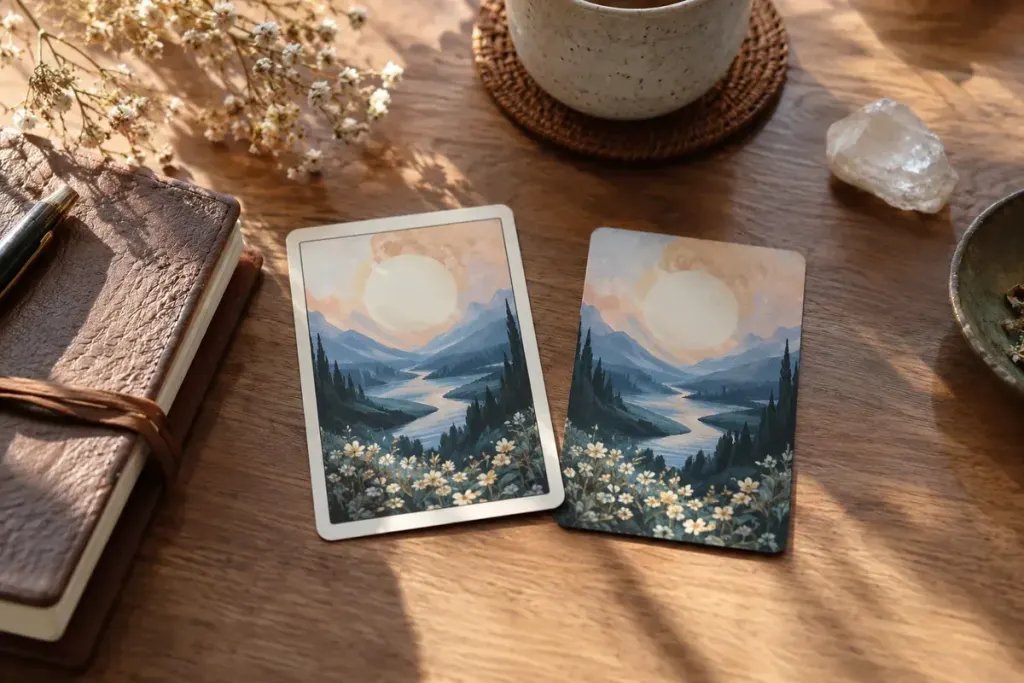
A borderless edition can make a familiar card feel larger even when the printed card dimensions barely change. The frame around an image directs attention. Removing it can bring the scene closer to the edge of your hand and change what you notice first.
Approach the comparison as a visual exercise. It does not establish that one edition is more powerful, accurate or spiritually authentic. Tarot can be used for reflection; an edition choice should not be treated as evidence about future events.
Compare the same image
If you have authorised editions of the same artwork, place the matching cards beside each other under consistent light. Check whether the border was removed by enlarging and cropping the picture or by revealing more of the original image. Those are different changes.
Look at the nearest object to each edge. Has a hand, tree branch or patch of sky disappeared? Does a printed title remain, move or vanish? A borderless design may also alter numbering and labels, which changes the practical experience of finding your place in the deck.
Write three observations before opening a guidebook. For example: “The figure feels closer”; “the lower object is cropped”; “I look at the background first”. These are descriptions of your response, not new universal meanings.
Test the deck as an object
Readability, card size, finish and how comfortably you handle the deck matter too. A beautiful image can be less convenient if essential labels are difficult for you to see. Consider those needs before buying a second edition simply because its photographs look more immersive.
Keep a record of the artist, publisher and edition when comparing notes later. Otherwise, a change in printing can be mistaken for a change in your interpretation. The border is one part of the encounter with the image, not a verdict on how you should read it.